EN7010 A New Beginning
EN7010 A New Beginning
The standard is applicable to all premises types, especially public areas and workplaces. Any premises, where there is a requirement for safety signs to convey safety information, can benefit from the standard.
As of 15th October 2008 the status of the standard has changed to signify its periodic review.
During this time comments regarding its usefulness and suggestions for improvement are open to submission which may result in its revision or content addition. However, the likely outcome of the review is that the international standard will become a European Normative. This will take it from being a 3rd party guide on best practice to being required to be written into every European Country’s health & safety laws.
Such an event will have huge implications for premises across EU countries as it will essentially become illegal to use non-standardised signs. Places such as workplaces, event venues, eateries, shopping centres and many others will be required to replace all non-standardised signs. Those responsible for Fire Safety in a premises and the Fire Safety Industry as a whole, should use such an event to consider the further implications of correct signage.
A long time ago in an office far, far away…
In the late seventies it was coming to be recognised that as the idea of a European Community was becoming ever more a realised dream so too would come with it the problem of a large multicultural migratory workforce, that of communication.
The danger to foreign worker safety, not to mention those with reading difficulties, disabilities and poor eye sight, of using text based safety instruction was unacceptable. What was decided to be needed was a method of instruction free of a dependency on language and understood by all.
The natural solution was to use pictograms.
Definition of Pictogram
A picture that represents a word or an idea by illustration”
Through the use of pictograms a language in safety was to be developed which would comprise its own vocabulary and grammar expressed through the design, colour and shape of the sign. This would come in the form of the publishing of the first international standard for Health & Safety signs in 1984, ISO 3864 – Safety colours and safety signs
“Prescribes graphic symbols for the purposes of preventing accidents and health hazards and meeting emergencies.”
Signs were broken down into the types of information they convey and colour coded accordingly. The colours themselves were related to the type of instruction being given by the sign, for example attention grabbing, stark contrasting, yellow and black for signs purveying immediate hazards.
This was to be part of the grammar of signs. The colour coding to the instruction type was a way of assisting the better intuitive understanding of the sign with no supplementary text. The design also of the signs themselves would form part of this subtext of instruction. Prohibition signs used a circle and strikethrough design motif to further enforce the idea that what was being depicted was restricted and “barred”.
The Legislators strike back
With an International Standard in place, the first step to standardisation had begun. Signs had been given meaning they never had before simply through design and colour. It would have to be hoped however that manufacturers would adopt this standardised method of sign design and colouring as the requirements of ISO3864:1984 had no grounding in law. Some manufacturers, especially those pivotal in the formulation of ISO3864:1984, were eager to produce the new design signs and lead the industry in a drive towards international standardisation. Unfortunately the realities of business and production methods meant that many manufacturers were slow to change if inclined even to do so at all, resulting in the output of standardised and non-standardised signs alike by the Safety Sign Industry.
In those times the concept of Health & Safety and Fire Safety, of the high levels we are familiar with today, was not such an integral part of workplace life. As such, apathy amongst premise sign purchasers and the confusion caused by an industry unable to commit to a standard of sign production caused a mixture of signs to be used nation and Europe wide. The inadvisable practice of using solely text based signs for Health & Safety instruction could also continue.
So the proactive beginning that was ISO3864:1984 fast became a fading dream but the necessity of its ideals still persisted, continuing to grow as did the EU free trade community.
With the beginning of the nineties came greater economic stability and with it the number of migratory workers within Europe increasing once again. Throughout the eighties there had been some particularly high profile fire related disasters in Europe and across the globe, some of these highlighted the need for better standards when it came to fire safety and using signs to give instruction during emergencies.
In order to resolve the matter and to promote greater safety for EU community members an EC directive, based on the guidance of ISO3864:1984, was passed which would make it a requirement for every EU member state to write the directives requirements into their countries Health & Safety Legislation. This was EC directive 92/58/EEC
Return of the Safety Signs
The contents of EC Directive 92/58/EEC were required to be written into the Health & Safety law of England. This occurred in the form of the Health & Safety (Signs and Signals) Regulations 1996. The regulations made it a legal requirement for standardised design and colour pictogram based safety signs to be used at all premises. This was surely a massive step forward to make it a legal requirement which meant that non-compliance could result in hefty fines if a premise was in breach of the regulations. Standardised signs conforming to the best practice of ISO3864 would help to ensure the safety of workers both foreign and national alike and promote better working conditions.
This achievement in safety signing was not without its drawbacks however. The concern had been to move away from using text based instruction and to move towards intuitive pictograms.
This was begun with the standard and achieved with the EC directive. What had not been a priority and as such could have been considered an oversight was what pictograms would be best to be used? The regulations specified an example of what could be used, for an exit sign this was an illustration of a man, an arrow and a white block, and specified that only this or something offering greater intuitive comprehension should be used. Many believed these example images were law and they soon came to be known as the “Euro” signs.
What was later realised is that in the move to pictograms it had introduced an element of ambiguity into safety signs. People followed regulations using the specified colours and designs but were free to choose the pictogram they felt best depicted the signs message. From workplace to workplace, indeed country to country, you could find different versions of the exit sign. The “Euro” sign is a prime example of this ambiguity. What had started as an attempt to bring international harmonisation created international difference.
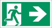
People often believe the correct sign to hang above an exit door is the version of the “Euro” sign where a man is depicted then a directional arrow pointing along the landscape sign to the right where at the end of the sign is depicted a white block (the exit). This sign, actually the “for Fire Exit head right” sign, demonstrates a man exiting but uses an arrow, often perceived as a directional instruction, to signify his movement to the exit. In times of emergency and reduced light conditions this could be construed as instruction to head in the direction of the arrow to reach an exit, which in the case above would in fact be away from the actual fire exit.
A Happy Ending
So, one success in an exercise of safety was a failure in another. The situation required rectifying.
What would now be required was the specifying of the correct type of pictograms to use for the particular hazard. Following the years of the introduction of the 96 regulations, British safety signs manufacturers came together to produce a unified, all encompassing standard for Safety Signs.
In 2002 this led to the revision of the previous British Standard and publishing of BS 5499:2002 – Graphical symbols and signs. The series covered the whole range of use of safety signs starting with the design, finishing with the placement as part of a Way Guidance System and in between making clear, most importantly, the best and most intuitive pictograms suited for use.
With this need for correct pictograms clearly recognised the International Standards Organisation were compelled to update their own and what better inspiration to draw from than the all encompassing British Standard. This new requirement however, for both specification of sign design and correct pictograms, resulted in the division of the standard into several parts. ISO3864 would become
1.ISO 3864-1:2002 – Graphical symbols — Safety colours and safety signs
2.ISO 7010:2003 – Graphical symbols — Safety colours and safety signs
Safety signs used in workplaces and public areas
Parts 2 & 3 to ISO3864:2002 would come to be published later (see below)
ISO7010:2003 now would contain the details regarding correct pictogram use.
The European community now had a best practice guide, once again, for safety signs that was intended to further harmonise safety signing across premises. As with its Predecessor ISO3864:1984 and with any best practice guidance, ISO7010:2003 would be followed by some manufacturers but not all and some facilities managers would be aware of its guidance, others not. Almost as if history repeats its self what has come to be realised is that to ensure safety and harmonisation it will be required to write into law the guidance of ISO7010:2003 in the form of EN 7010
So what will it bring? For Health & Safety managers across Europe finally it will allow the use of a common platform of language in Safety Signs, normalised throughout Europe and regarded as best practice across the globe. The task of Safety Signing which can be considered to be to Locate, Identify, Inform, Instruct & Educate, can now be accomplished in a way never before possible. We are able to locate signs relevant to our current need as we are able to identify them using the intuitively understood colour coded grammar of signs. Through a standardised, unambiguous set of pictograms, signs can inform us of important information relevant to our safety and instruct us when necessary to keep us safe, both without relying on text instruction. Finally, in every sense of the word, signs can educate us when moving around a premise, the grammar and language of the signs educating us on Safe Condition locations, Fire Safety measures, Mandatory Actions, Prohibited actions and Warning us of danger. Finally signs can be simple, signs can be safe.
Safety Signage Timeline
ISO/R 408:1964 – Safety Colours
ISO/R 557:1967 – Symbols, dimensions and layout for safety signs
BS 5499: 1978. – Fire safety signs, notices and graphic symbols
BS 5499:1984 – Fire safety signs, notices and graphic symbols
ISO 3864:1984 – Safety colours and safety signs
BS 5499-1:1990 – Fire safety signs, notices and graphic symbols.
ISO 3864-1:2002 – Graphical symbols — Safety colours and safety signs
BS 5499-1:2002 – Graphical symbols and signs. Safety signs, including fire safety signs
ISO 7010:2003 – Graphical symbols — Safety colours and safety signs
Safety signs used in workplaces and public areas
ISO 3864-2:2004 – Graphical symbols — Safety colours and safety signs
Part 2: Design principles for product safety labels
ISO 3864-3:2006 – Graphical symbols — Safety colours and safety signs
Part 3: Design principles for graphical symbols for use in safety signs